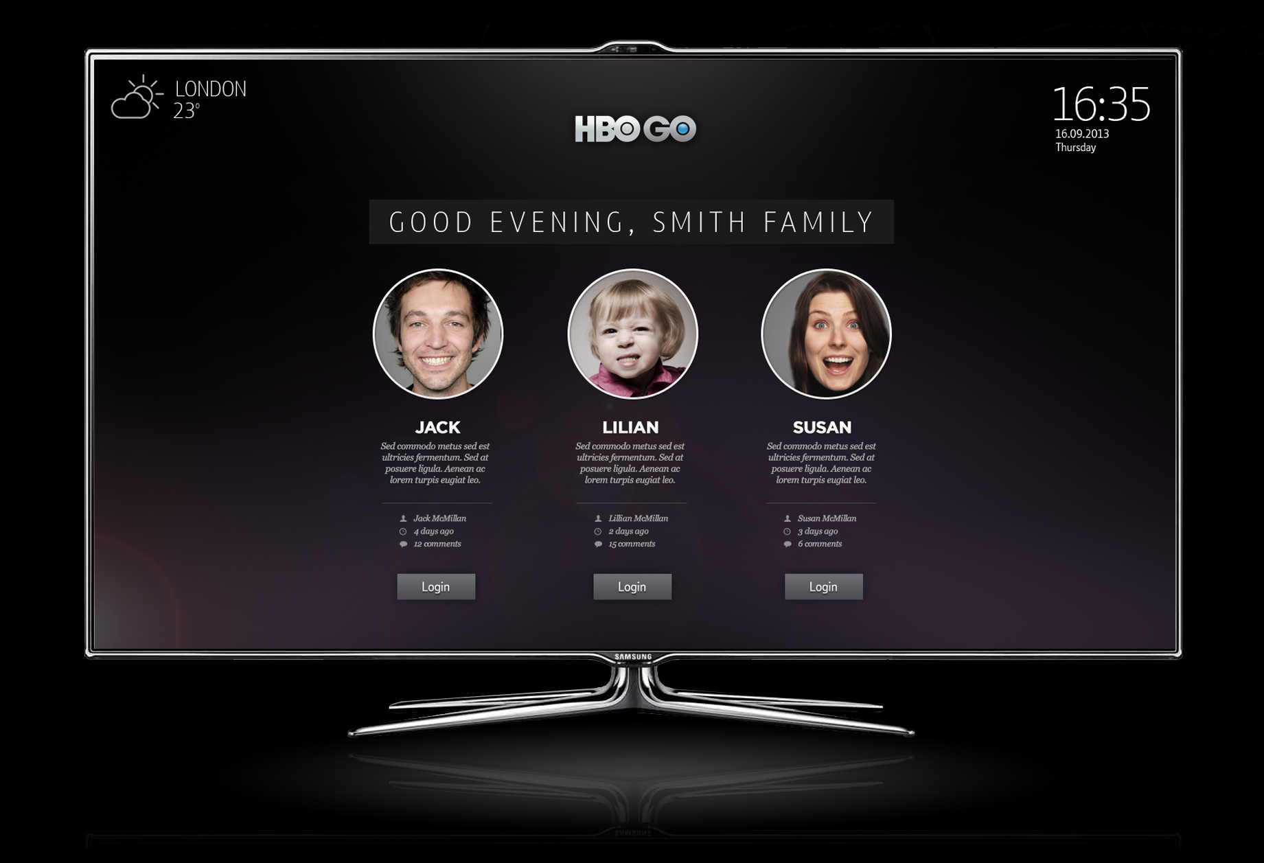
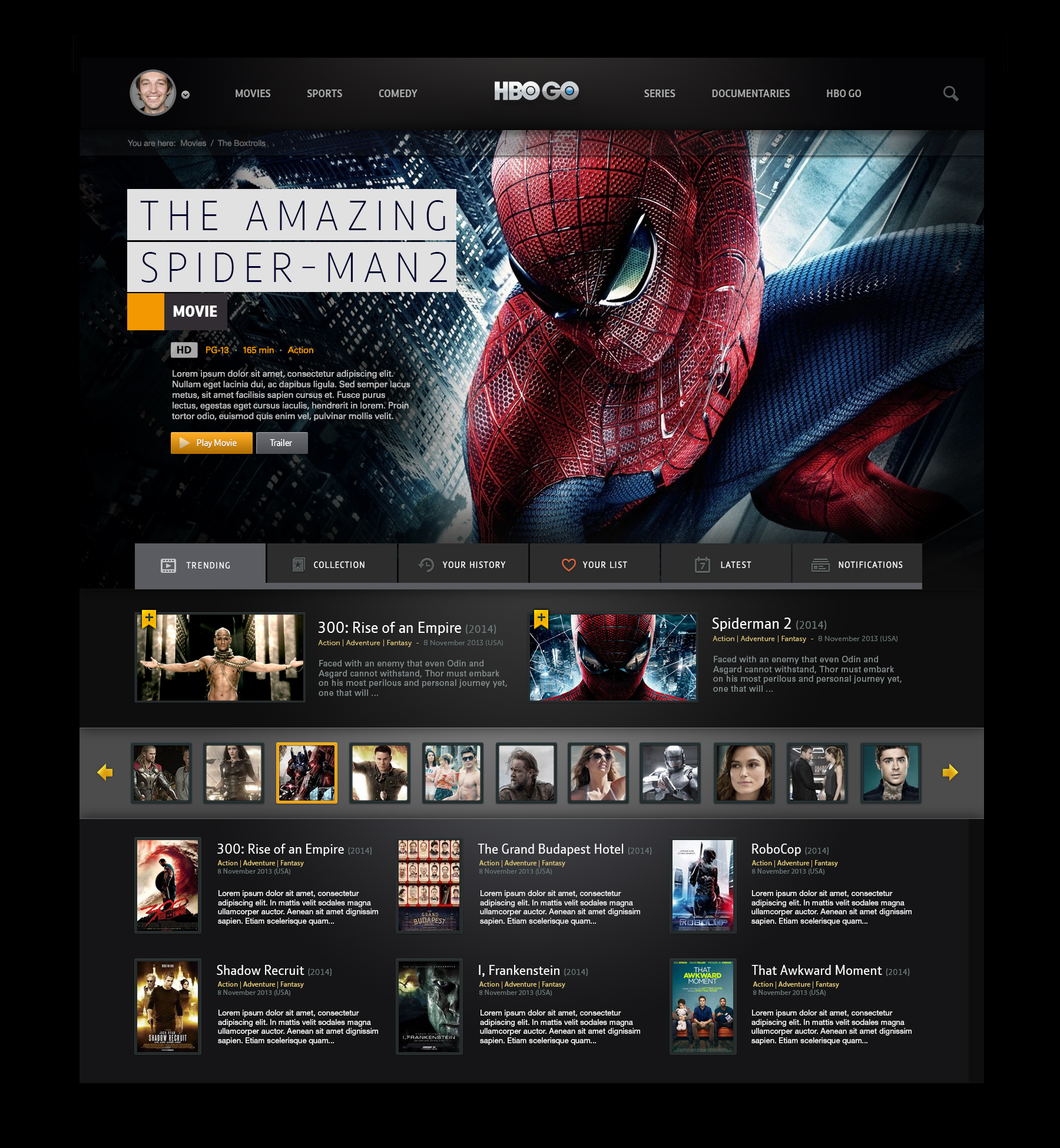
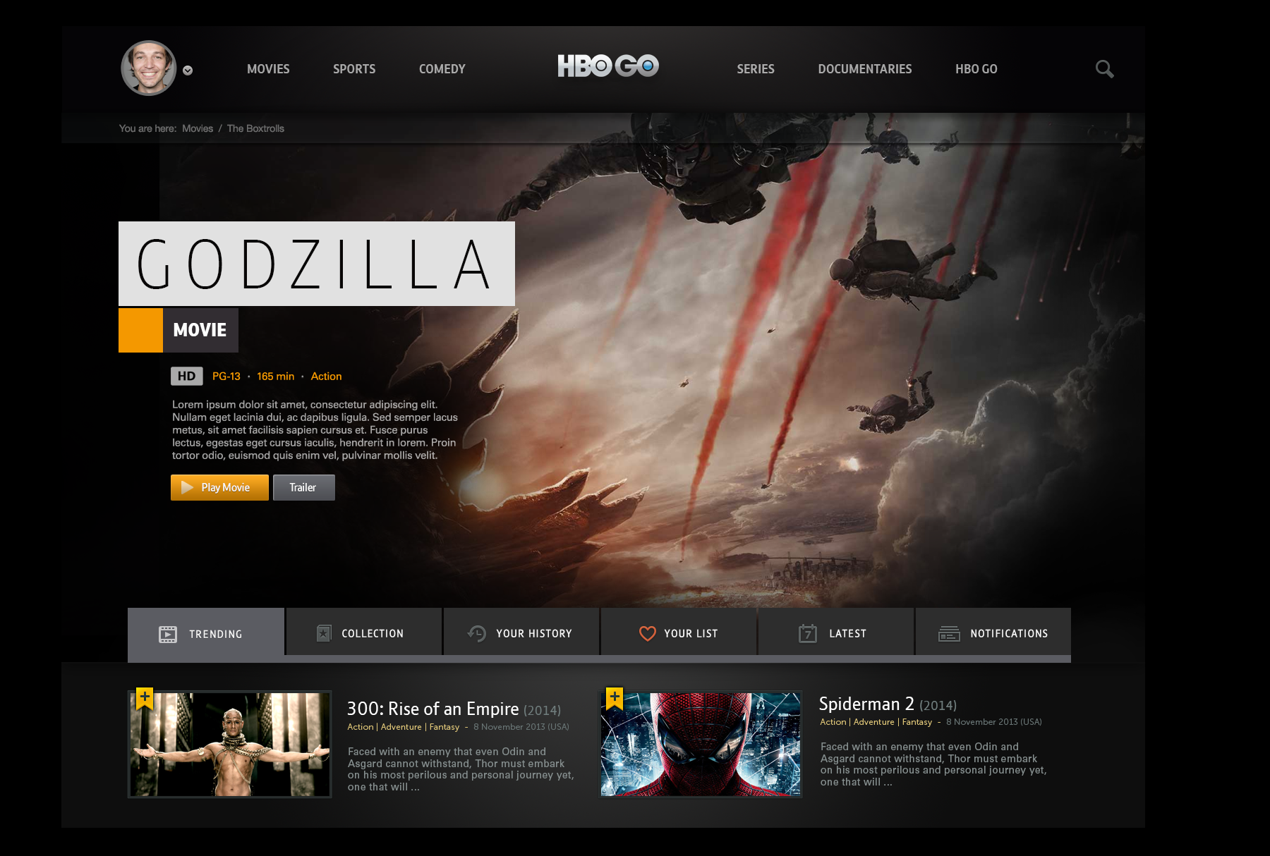
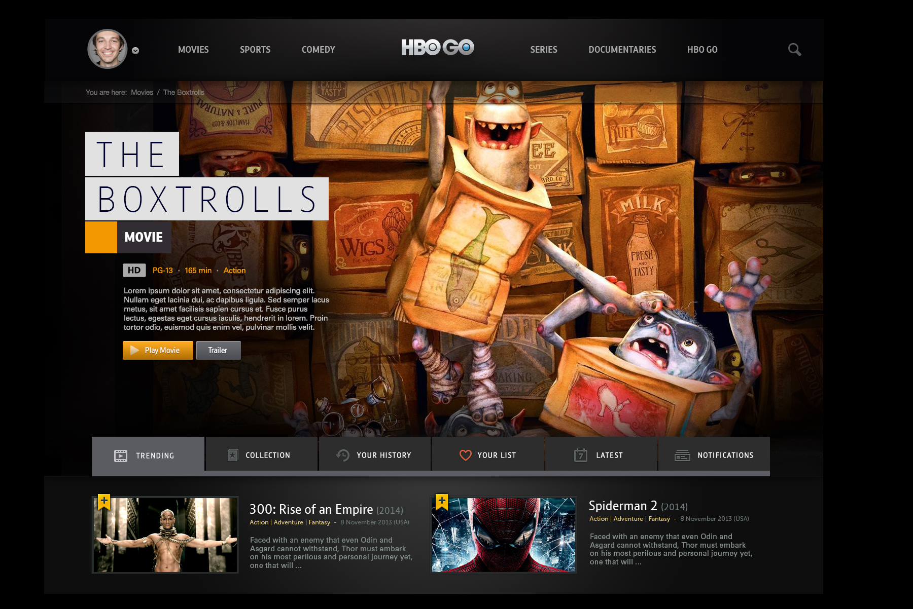
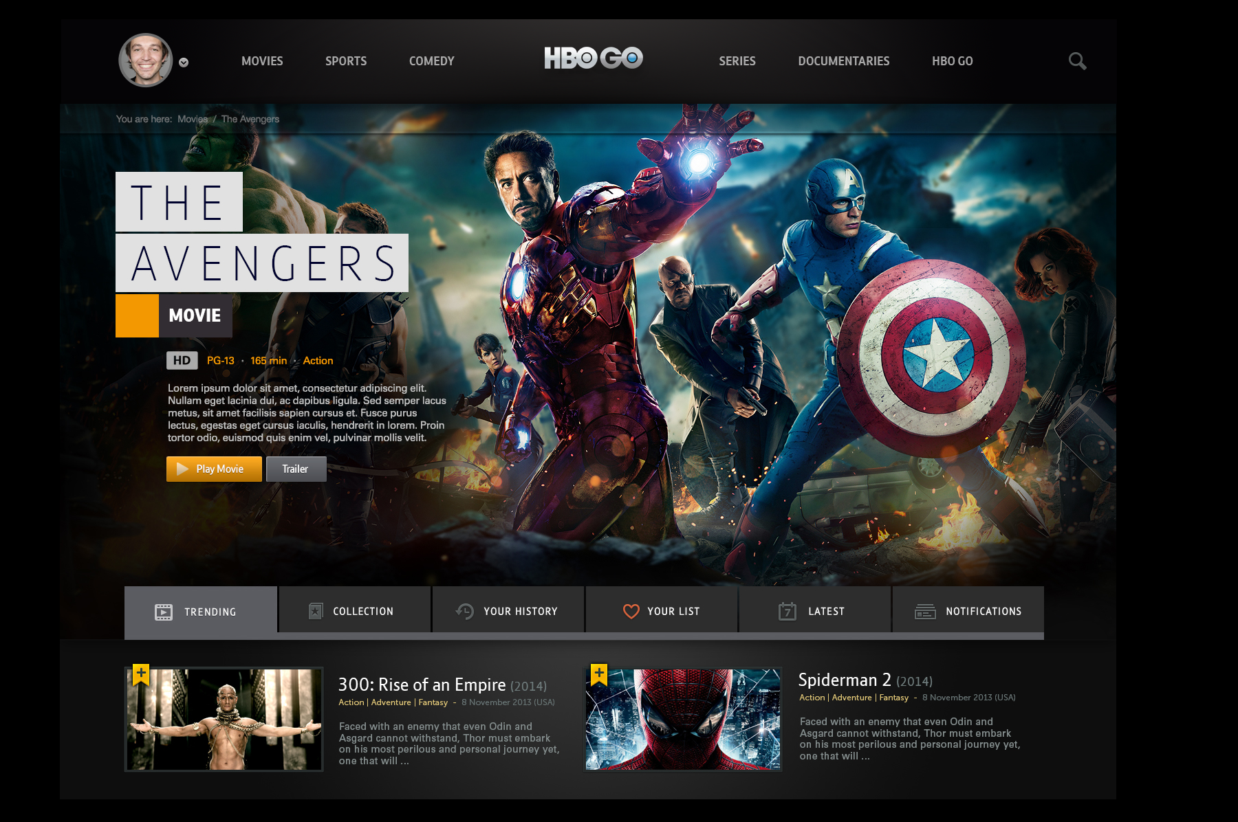
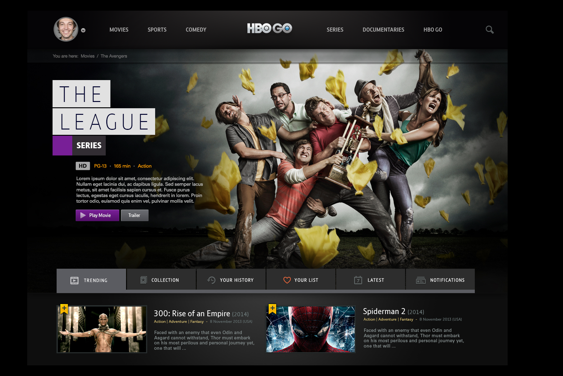
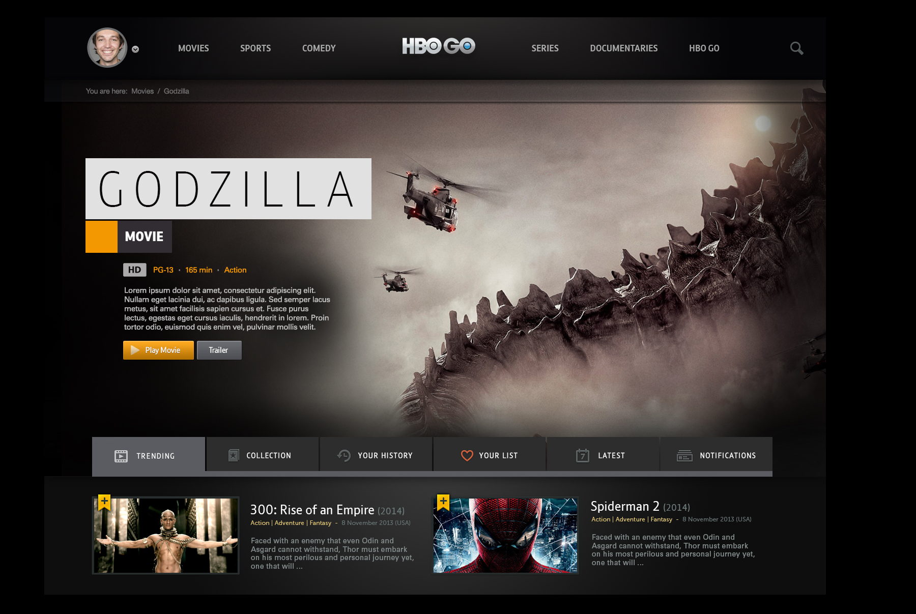
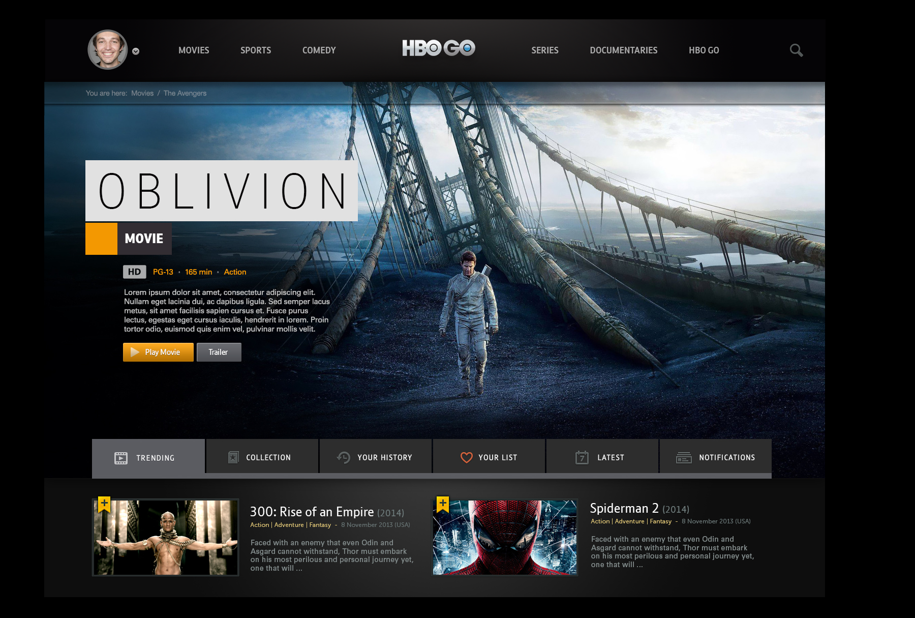
Conceptual exploration and UI deep-dive into the first truly digital tv platform.
I was asked to quickly conceptualize some high level visual treatments for the HBO GO online interface - establishing a top line visual language and system that could then be applied to their apps and other device platforms. We began to uncover new interaction patterns and evolving use cases, as platforms like Apple TV, Amazon and Netflix were in their infancy. The HBO Go platform ultimately become much more simplified and streamlined, yet these are initial explorations that touched upon a few visual elements that inspired us to dig deeper and further refine.
